
10 Top Typography and Font Trends for 2021
I sometimes use affiliate links in content. This doesn’t cost you anything but I may make a commission payment from anything you buy through these links. As an Amazon Associate I earn from qualifying purchases. All opinions remain my own.
For me, trends can either be something you use to grab a moment and make the most of it or something you avoid so you aren’t similar to other people. When it comes to the top typography trends for 2021, you can dive into these without worrying about seeming same-ish because there are so many ways to use them.
But let’s dive into what the trends are and how you can use them.
Table of Contents
Do fonts really matter?
I’m a bit of a font collector if I allow myself and I love trying out a new font in different ways. But not everyone has that gene and to those of you who don’t, you might be wondering if fonts really matter. After all, they are just a way of fancying up the words on the screen, right?
Yes, but they are a lot more than that. Fonts are one of the key elements of branding and can convey a massive amount to people about your brand very quickly. Not only is there the look and feel of the font but also the practicality of it. For example, script fonts are gorgeous and work fine for odd words on a Pinterest pin but you don’t want the text of your website to use them.
Some fonts just have automatic associations with them. Serif fonts tend to be seen as classic, timeless and sometimes traditional. Sans serif fonts are seen as modern and less formal. These aren’t rules and don’t have to govern what you use but there’s always this general vibe about them.
Top typography trends
So taking a moment to learn about typography trends and what fonts are popular for this year is never a bad idea. It is very important if you plan to do a re-brand but even for things like Pinterest pin design, Instagram posts, even text overlays for video marketing – fonts play a part in them all.
Let’s dive into what the experts are saying about big font trends for the coming year.
Brutalist style
Mention Brutalist and you wouldn’t be wrong for thinking this was to do with architecture – that’s where the movement really came from. It is characterised by harsh, straight lines and very little in the way of decorative elements.
In typography, the trend is for Brutalist style that’s a little softer than the original version. It still has that strong feel and isn’t something you can ignore but it is just a little softer this time around.
How to use it: ideal with muted colours but test with the odd really stark shade like a neon pink or bright yellow.
Big and bold headlines for fonts
This is more of a font use than a typography trend but is good to know. Using those big and bold headline fonts is going to be popular this year. It helps to grab people’s attention as they skim through their social media feed. Dialling up the font size as big as you can go is part of this.
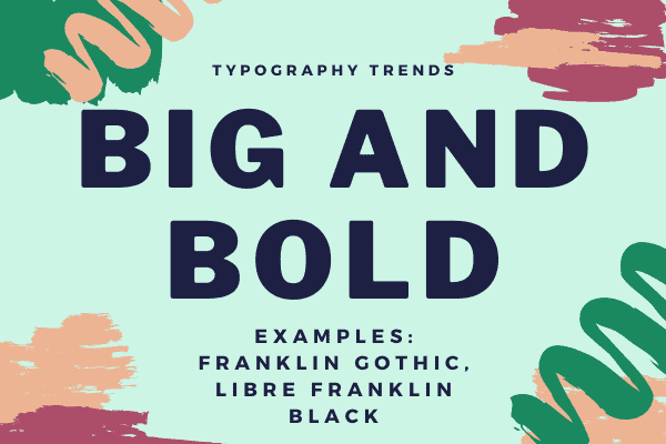
How to use it: headlines on websites, on Pinterest pins or social media graphics, on flyers or other printed materials. Try different eye-catching colours with it.
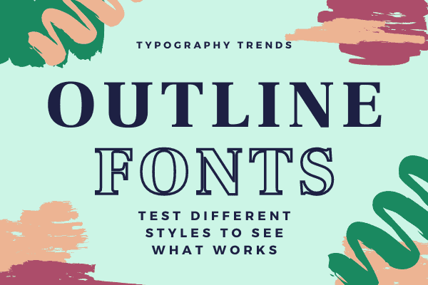
Outline fonts
Outline fonts always look effective for some reason and this year they get to be a trend in their own right. You can combine them with solid versions of the same font for an effective look. Just remember the background when using an outline font and ensure it is easy to read.
How to use: hero section of headlines, Pinterest pins, printed materials
If you are a Canva user, one of their newer features is to change almost any font into an outline version (just as you can see below) so this makes it easy to combine the outline and solid versions.
Sans serif fonts going beyond the usual
We are all familiar with sans serif fonts, the ones without the little elements on them that have a cleaner, modern look. But the trend this year is to have sans serif fonts that have a little more design to them than normal.
How to use: sans serif fonts are often used for body text but with these extra elements, I’d stick to using them more like an accent font to ensure your copy is readable.
Stark looks – black and white
Being able to read typography is one of the ongoing battles and the simplest way to ensure this is to go with another trend for this year – black and white. Minimalism has been a typography trend for a few years and it goes full-on with this trend for 2021.
Don’t be afraid to use white on black and to mix up fonts to get interesting looks. Test underlining some words in one font while making another Italic. Just always ensure you can easily read what is there.
How to use it: great for social media covers, hero images or anywhere you want to grab attention (as long as it works for your brand).
Layer over text
Layering text over images can be very effective but also needs to be done carefully. Colour filters can be a good way to help with this, toning down the image and making it easier to read the text. So the placement of the text over the elements of the image is important to consider.
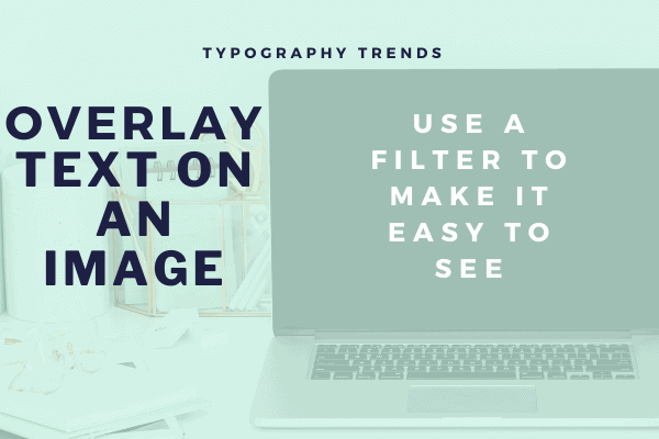
How to use it: header or hero images, Pinterest pins, anywhere eye-catching.
Bright psychedelic colour palettes
Using those super bright psychedelic colour palettes combining colours of the background and the font is another big trend. But definitely, one to use carefully! A slightly less stark way to use it is something with a rainbow tie-dye effect as a background with black or white text.
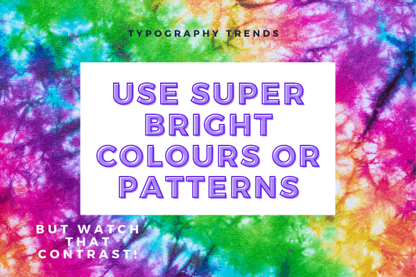
How to use it: again, for me, it is those headers and hero images as well as in some social media posts such as quotes. Just remember that contrast!
Interesting serif fonts
Just as sans serif fonts have added a few features, serif fonts have got interesting for 2021. From abstract looks to retro styles that look like something from the 1970s or even something a little fun, the serious group of fonts are having a little experiment into something less serious.
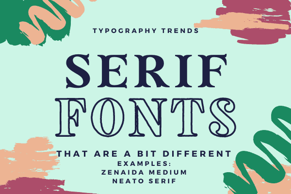
How to use it: accent fonts, pairing alongside sans serif but not in place of body text.
Fat and low font styles
No, we aren’t being impolite about these fonts, they are classed as fat and low because they have a low x-height and are a little wider than they are taller. The result is a chunky look that stands out and can be used in lots of ways. Space them out a little further than normal so they are easy to read.
How to use it: headlines and headers, anywhere you want something a little different but still easy to read.
Animated typography
Lastly, there’s the use of animated typography. This is anything from scrolling text moving across the screen, letters flying on or off the screen or even having the text fading from the background. Just remember, these will use a little more resources to create these effects.
How to use it: ideal for video marketing to create moving text and styles to overlay still or moving images.
Making the most of typography trends
With typography trends, you don’t want to try and use a load of them. But picking one or maybe two that you use in different ways can help spruce up your branding or give your social media something different.
What trend do you think you could use for your business?




Wao! A helpful article, These font trends are really awesome. This list of typography is not only for 2021, it is suitable for every time and every time. Thanks for sharing this interesting blog post.