
How to Make Pinterest Graphics that People Want to Pin
I sometimes use affiliate links in content. This doesn’t cost you anything but I may make a commission payment from anything you buy through these links. As an Amazon Associate I earn from qualifying purchases. All opinions remain my own.
If I was to sum up the point of Pinterest graphics it would be something like this – make an image that catches people’s eye, and makes them want to save it and click it. But that’s easier said than done.
The good news is that you don’t need a graphic design degree to make Pinterest graphics that people want to pin – because we can pick the brains of the people who have!
Table of Contents
Image size
Before we start talking about what goes into the image, let’s spend a moment on image size. It’s a funny one because there are few rules but some strong recommendations.
Top of the list is that you use a 2:3 ratio. On Canva, that is 735 x 1102 pixels. A standard size might be 600 x 900 pixels. Or a slightly larger one I’ve seen mentioned is 1000 x 1500 pixels.

For food bloggers in particular, the really long pins have been a big thing often called ‘giraffe pins’ (though don’t ask me why) and these are often around 700 wide but much longer, 1500+ pixels.
At the Creator’s Conference, Pinterest said that these would be cut off in the Smart Feed, so you wouldn’t see all of the pin. This doesn’t mean banned or anything, just shortened. So if you are passionately in love with your giraffe pins, keep the text to the top third so it doesn’t vanish.
5 things the best pins have
In a recent Live, Pinterest said that there are 5 things that all the best pins have and the top pins have at least two of these. Now, these aren’t so much design elements as ideas but it is worth having them in your mind as you create pins.

Pinterest Graphics and Images
You can make Pinterest graphics without photos in them – there’s no rule that says you need to. But for some niches, it can be better to help people visualise what you are talking about. And even for niches like mine, blogging and online business, you can use images to help attract attention.
Some people are against stock photos and that’s cool. But personally, I’m not in a position to take a set of photos of my own for every single post across three blogs. And buy all of the gear needed for those photos. So the answer is quality stock photos.
For starters, I subscribe to Ivory Mix. This is a very reasonable monthly charge and Kayla adds new images every month. They are brilliant for my business blog because they are bright and colourful but also feature tall images that are perfect for Pinterest.
She also creates lots of great content to help you use her images in pins and other places. Here’s an example:
For free stock sites, I use:
Whatever sites you use, make sure you check the terms of use. These sites allow you to use the image without credit, although you can add one if you like. Others will stipulate you need to add certain credits, such as Wikipedia and Flickr. Always comply with the rules or it can land you in hot water with the image owner.
Canva also announced that they have made all of their images free to use if you have a Pro subscription. This is something like 40 million or so high-quality images that can be used for business. Added bonus – they are accessed through the software so you can search, grab and add them where needed!
Balancing the fonts
I’m always tempted to get more fonts when I come across them. I remember when I first got a computer, I would write documents in all different fonts, just to try them out. And there’s a similar temptation with pins but…
Resist! Too many fonts can make for a confusing, chaotic look. And while I love a good script font, if they are too script-y they can be hard to read, especially on mobile. Most people are on mobile these days, so this is always a primary consideration. You may even have custom fonts you want to use that feature in your branding but think of things from a Pinterest perspective before you use them in your pins.
This pin is brilliant because it uses a serif font for the number, a nice easy-to-read script font for emphasis and then sans serif fonts for the rest of the information. There’s colour to add and an accent as well.

Font colours
Not only do you want to balance the fonts you use but you also want to make sure they are clear and easy to see. Contrast between background and fonts is important if you want people to read your headlines – and then click your pin.
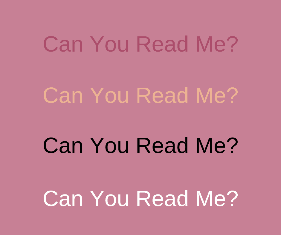
Here’s a really simple example of four colours on one of my brand pink shades. The first is a slightly darker pink and is hard to see as is the rose gold shade. The black is pretty clear but the winner for me is the white text.
Other font tips
Also, think about the size of your font – bigger is definitely better here! While you don’t want the words to blank out the images, try to use as big a font size as looks good. Think of those mobile viewers on their little screens.
Don’t forget about visual hierarchy either. What’s what? It is a way to use different fonts, sizes, and colours to put emphasis on different words. To quote Kimi Kinsey:
When the text is the same size, colour and weight, it looks boring and nothing stands out
But if you make an important word larger, use a readable script font, or make it a different colour then this can help catch the eye and make it instantly easy to see what the most important parts of the headline are. In the pin I made for this post, Pinterest Graphics are highlighted and in different fonts and colours, so you see those words before all others.

Colours
Alongside fonts, I love colours and sometimes get bored with working with brand colours. So here’s my trick. The first Pinterest graphic that I make and that goes into the post uses my brand colours. Then when I made additional pins to add later, I’m not quite so strict.
The reason to use brand colours is to help people recognise your stuff. We’ve all done it, you scroll through Pinterest and you notice a pin from a favourite blogger – because you recognise the look and style of their Pinterest pins. You then repin it because you know their stuff is quality. That’s why that first pin should be branded.
But after that, try something different!
Little tips
Putting together a Pinterest image template will make your life easier – I have at least 4-5 for each blog. And there are some little tips to incorporate into some of them that can help make your Pins even more appealing.
Quick tip!
Don’t feel like any of these are ‘rules’ that you have to follow to get your pins to rank. The key is to use some best practices to help you get a baseline for what your audience responds to. And if you love a good rule-breaking, check out this mini-eBook from Carly at Mommy on Purpose that teaches you all the design rules to break in your pins!
If there’s a freebie or content upgrade in a post, add an image of it. You can just take a screenshot or add a small version of the front cover or even use something like a smartphone or tablet mock-up to add the image. Don’t be afraid to put an arrow and state this is included for free.
If you are selling a product, show it! This pin shows the actual templates you are buying when you make a purchase and also has a little tab at the top to let you know what software you need to convert these templates for your own use.

Putting it together
There are lots of little tricks you will see out there to help make Pinterest images more appealing. There are even specialists in Pinterest graphic design who specialise in making pins that are appealing and effective. I asked a couple of them to tell me what makes a great Pinterest graphic for them:
For Cecille from The Blog Creative, the answer is simple –
Clarity of the message or copy…clear branding, typography (use of fonts)
Kristin from Applecart Lane even gave me a few examples –
Catchy, readable headline with a focus on Pinterest keywords. Aim for a relatable or emotion causing image or pack a punch with a solid or simple patterned background using your brand colors. Make sure you have a good use of contrast to catch viewers’ attention. Use your brand fonts and colors which are relatable to your audience. Add an enticing sub head or call to action to get viewers to click. Always put your URL at bottom of your pin.
Finding your own perfect pin approach can be a case of trying and testing. Both these ladies have some stunning templates available to purchase which are a great place to get instant, editable Pinterest graphics. And the more you use templates, the more you learn what you like and what works with your audience.
Getting the right templates
If designing pins isn’t naturally your thing, then I would suggest a template subscription! That way you get a monthly supply of templates that you can easily adapt in programs like Canva and can personalise to your brand colours, fonts and add photos.
Need some help with your pin design?
I recently joined a template subscription from Carly at Mommy on Purpose and she even offers a monthly coaching call and a Facebook group included in the price to help you get the most from the templates!